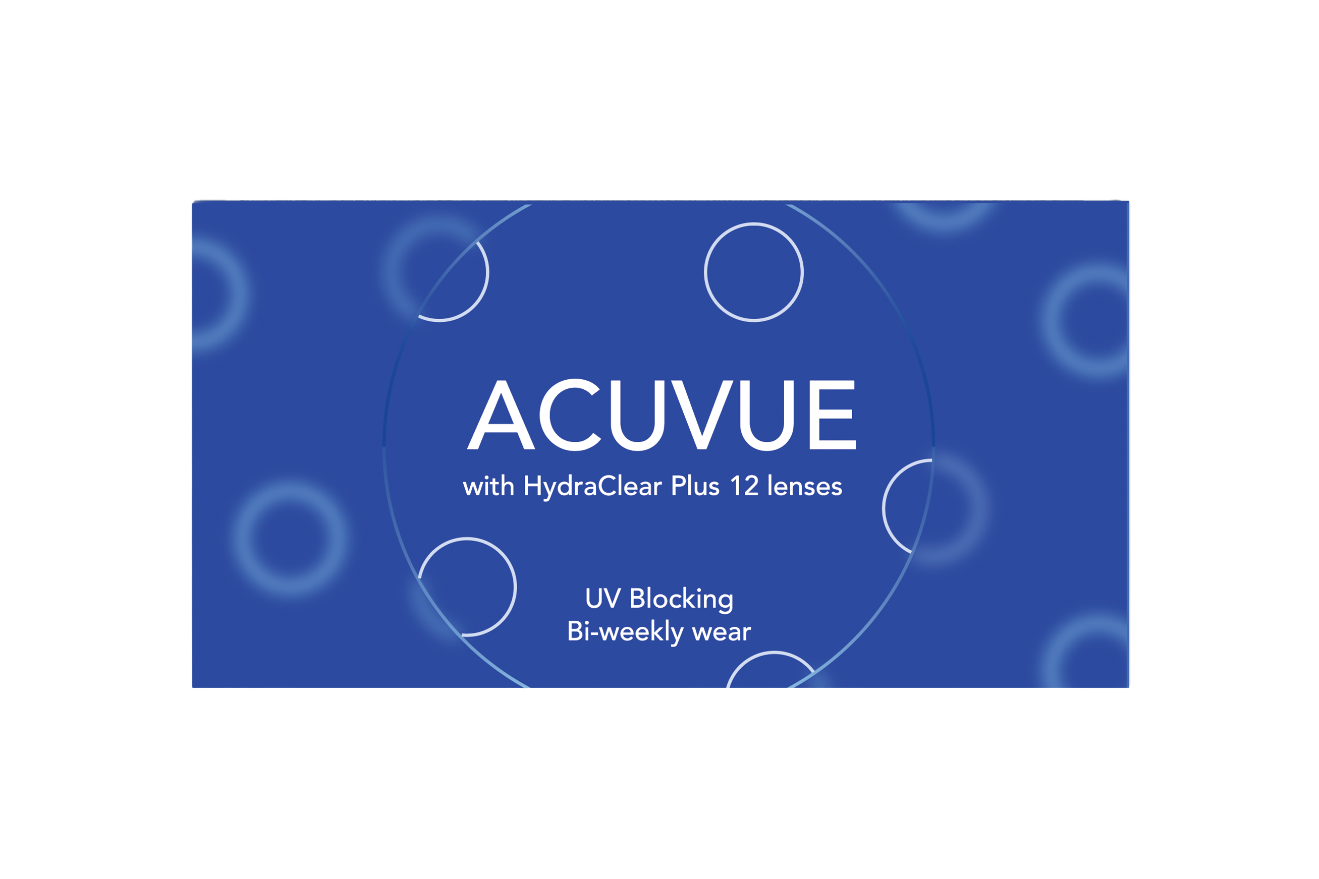
Acuvue
Contact Lens Packaging
Updated packaging design and identity for Acuvue Oasis Contact Lenses. Through redesigning a product that I interact with often, first-hand experience guided my design decisions. Contact lenses are considered a medical device, but allow more freedom in packaging design than similar products.
This refreshed packaging adds approachability and lightness to a market that typically appears very sterile. Consumers are engaged through the application of bright contrasting colors and simple shape alteration. All type has been adjusted to achieve optimal readability, and the packaging form was altered to make vital medical information accessible.
SCOPE
Brand Identity
Packaging Design
SOFTWARE
Adobe Illustrator
Adobe Indesign
Adobe Photoshop
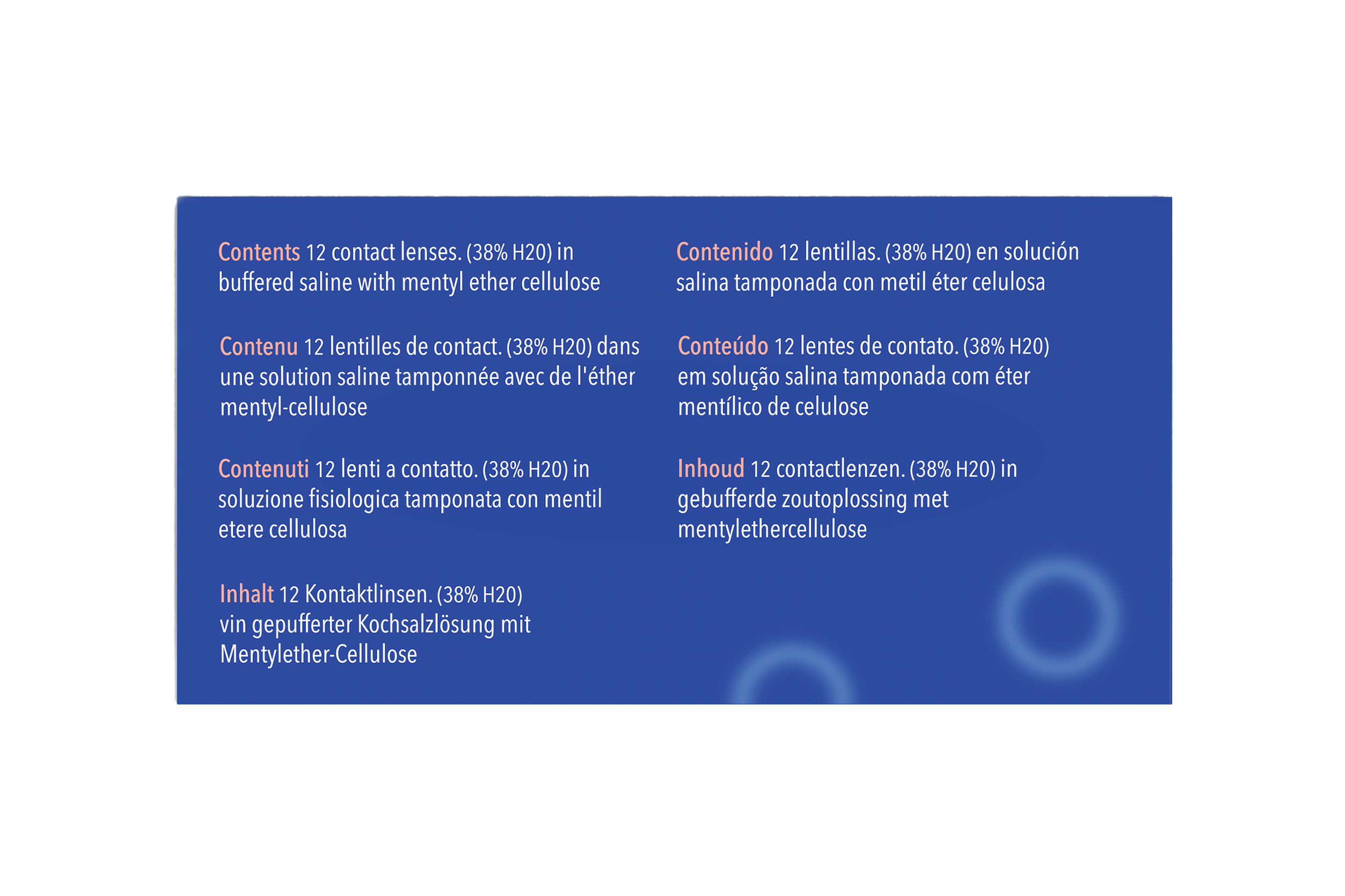
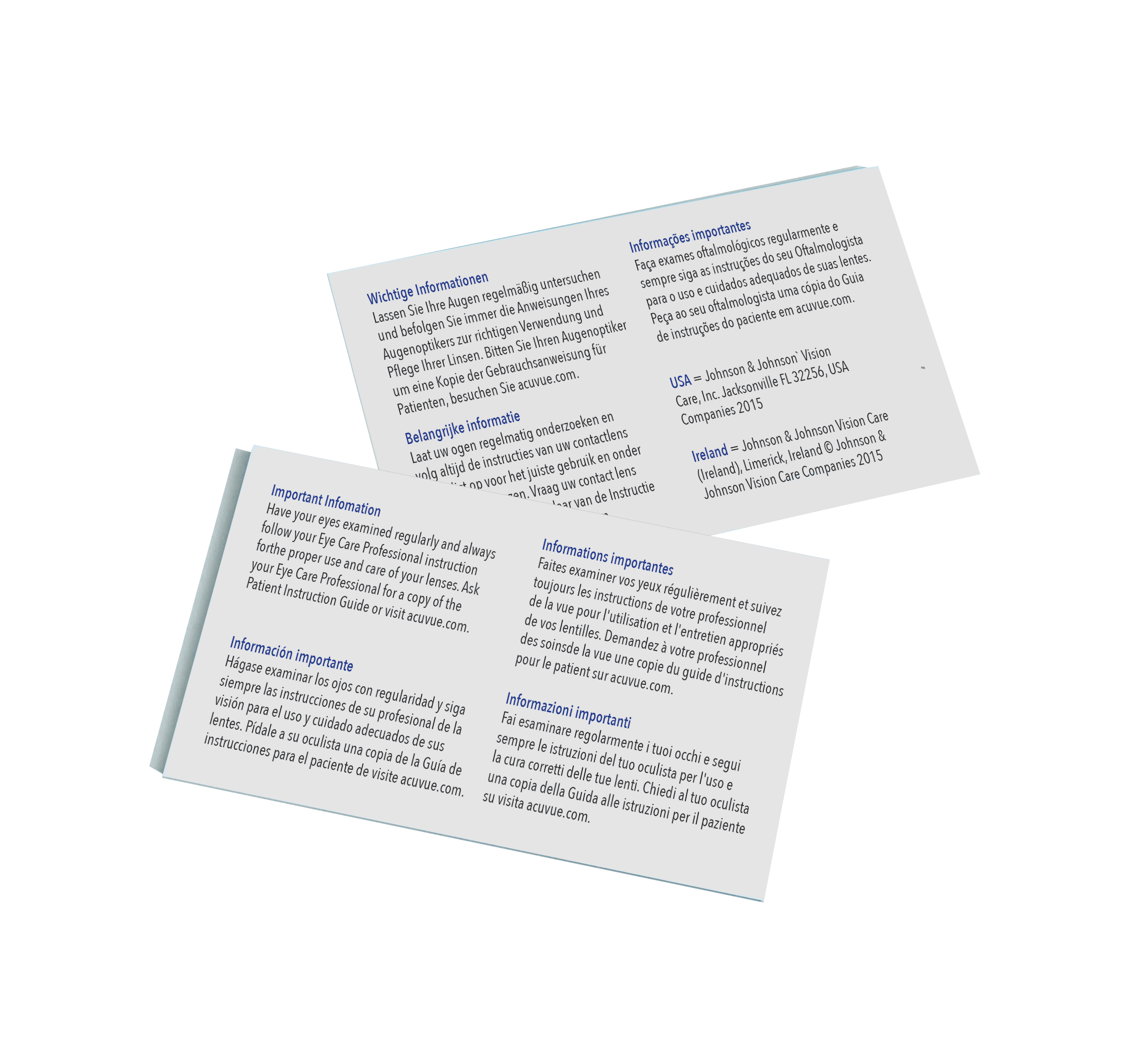
The multiple translations of the Important Information was placed on a double sided card, which sits inside the sleeve of the packaging, and can be removed. Previously, this text was hidden on the interior of the packaging, and was barely readable. Now, all translations are easily accessible for any customer